View
About
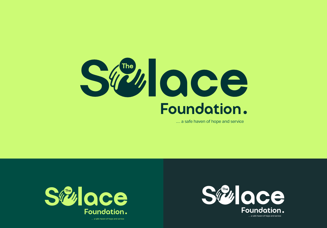
OVERVIEW
SOLACE is a compassionate, community-driven brand committed to service, hope, and emotional support.
CHALLENGE
The central challenge was designing a brand that felt emotionally warm and trustworthy without sacrificing structure.
SOLUTION
We created a soft yet modern brand system grounded in simplicity and care. The primary typeface (Advote) delivers a clean, classic tone, while General Sans and Open Sans provide accessibility and readability across channels. The color palette uses deep teals and natural greens (#003435, #004D43, #27EAA6) to convey trust, life, and healing, contrasted gently by soft lime (#CCFC75) for vibrance and hope.